Role: Product designer
Context: Booking platform
Duration: March 2022 - June 2022
My individual contribution
Led UX research, wireframing, and interactive prototyping for a mobile platform connecting horse owners with short- and long-term stabling options. Conducted user interviews, created personas, and designed intuitive booking flows tailored to equine needs. Delivered a high-fidelity prototype that helped validate the concept and attract early-stage investors.
Understanding the idea.
CLIENT DETAILS
About
Barn facilitates booking a variety of options for horses, including short-term stabling, layover stalls for travel, and long-term boarding facilities across a wide network. Users can search for facilities by location, view availability, message hosts, and securely book with a credit card, making travel with horses easier. Barn owners and other hosts can easily advertise and collect payments for their services through the platform.
Design challenge
How might we create a seamless and trustworthy digital experience that allows horse owners to find and book safe, appropriate boarding facilities for their horses—whether for short-term stays or long-term boarding—while meeting the unique needs of both horse owners and stable providers?
Project tags


Barn App
Visit app prototype:

Quick Research Facts
RESEARCH


Horses
In 2025, the total number of horses in the United States is around 6.65 million.
Equine Activities
Approximately 25 million United States citizens participate in horse related activities per year.
Horse Owners
There are 1.5 million horse owners in the United States.
Boarding Cost
Average boarding costs can range from $200 - $800 p/mo.


Asking the right questions.
KEY OBSERVATIONS
Research goals
There are many things to consider when designing a product that meets the needs of horse owners and enthusiasts looking for equestrian accommodations. It’s important to interview different types of possible users, as they can have many different needs.


Question areas
When doing user interviews, I tried to be laser focused about problem areas that were related to finding accommodations, and what make them choose they one place over the next. Digging deep into the ‘why’ of things helped frame the conversation when asking potential users how they went about finding and booking accommodations for their horse.
“What do you look for in a good accommodation for your horse?”
“What’s most important to you when selecting a place?”
“How often do you travel with your horse?”
“Are there specific amenities or conditions you consider essential?”
“How do you currently find accommodations for your horse?”
“What’s frustrating about finding accommodations for your horse?”

Key Findings & Results.
CLIENT DETAILS

Have trouble finding long-term
horse accommodations.
Horse owners face various challenges and concerns when searching for the right boarding stable, such as sub-par facilities, cost, & location.

Many equine enthusiasts
enjoy trail rides.
Over 25 million people in the U.S. enjoy equine activities - specially trail rides. Trail access close by a boarding facility is a huge plus.

Have challenges finding quick,
short-term accommodations.
Horse owners who travel long distances look for places to stop along the way to let their horses, and themselves rest.

Stable and barn owners can have a tough time finding renters.
Various places without a strong equestrian community might experience lower demand, making it more challenging to fill stalls.
Synthesizing user research.
PERSONA DETAILS
Bella Andersen
Kind | Healthy | Educated
Age: 27
Occupation: Registered Nurse
Status: Serious relationship
Location: Carmel, CA
I love where I live, but don’t have a space to keep my horse, and need a place for him to stay that is clean and safe.
Pain points:
Having a horse is great, but if you don’t have a coral or stable, you need a place for it to stay. When you are close with your animal, of course you want the best place possible! It’s very important to find a place that is clean, safe and not too far away.
Goals:
It would be great to find long-term stable or barn for my horse to stay. Ideally the place is clean, safe, and convenient to get to. A bonus if there are horse trails close by for easy access rides!

Jim Washburn
Hunter | Outdoorsman | Naturalist
Age: 53
Occupation: Rancher
Status: Married
Location: Petaluma, CA
I travel with my horses for hunting trips, and need quick and easy places for us to stop along the way.
Pain points:
I really enjoy pack-hunting with my horses, and often travel to other states to enjoy the variety beauty on offer. Along the journey, we need to stop, get rest, and let the horses rejuvenate from their cramped traveling conditions. It can be very difficult and challenging finding a place to stay making the trip planning somewhat stressful.
Goals:
I would love to be able to find places to rest my horses along the path of my out-of-state hunting trips. I need an easier way to find them to plan, and book my trips.

Laura Straus
Equestrian Competitor | Traveler | Designer
Age: 33
Occupation: Interior Designer
Status: Married
Location: Woodside, CA
Traveling to competitions can be grueling at times, and we often have to drive to long without resting. Ha
Pain points:
Traveling to competitions can be grueling at times.. and we often having to drive too long without resting ourselves and the horses. It’s hard to find ideal places to rest the horses when traveling to and from competitions.
Goals:
I would love to be able to take my itinerary on the go. At times, I do not have cell phone service which means that I loose access to my spreadsheet. I need a way to document digitally, but also export a PDF.

Understanding the competition.
COMPETITIVE ANALYSIS
Your Next Vacation Starts Here
A global online marketplace for lodging and tourism experiences.
Worldwide horse motel directory
Directory and service website connecting traveling equestrians with overnight stabling facilities for their horses.
Connecting equestrians with accommodations and experiences
Platform designed for horse enthusiasts to find and book various equestrian accommodations and experiences

Lo-fidelity Ideation.
USER FLOW
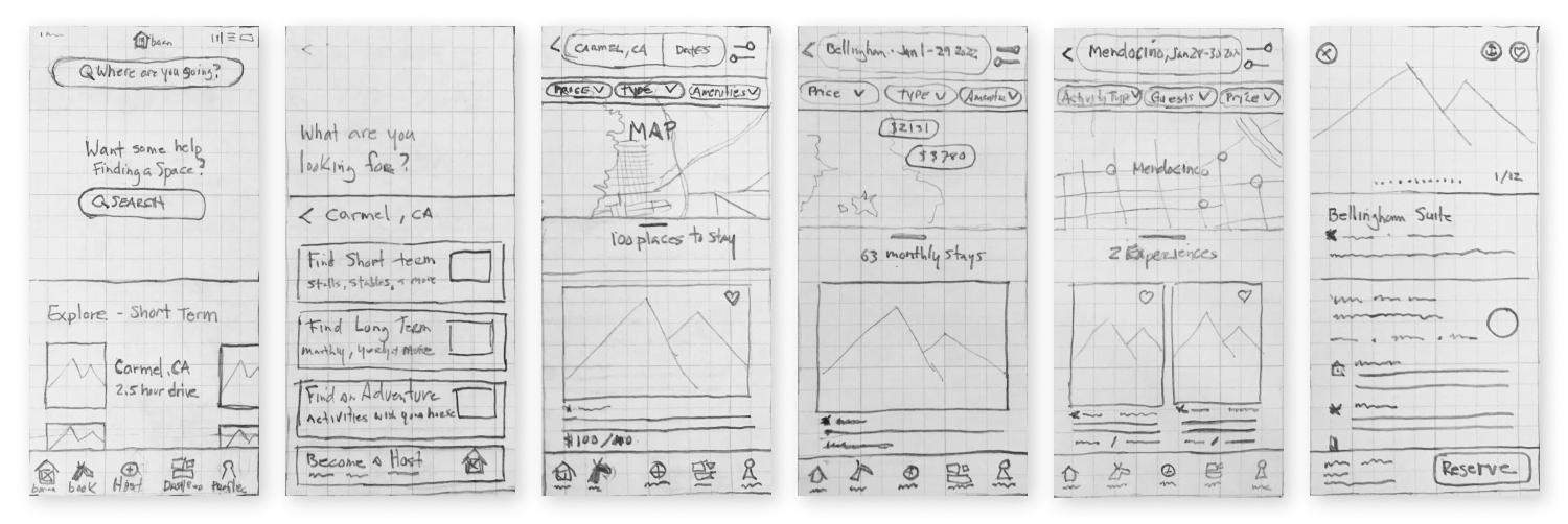


USABILITY TESTING
Prototype & Test
Design Pivot
After getting early feedback, it was clear that the filter system needed to be improved. After two design UI updates, users were able to complete their task easier with less confusion.

Getting early feedback
Using Figma, I created an interactive prototype, and prepared a remote usability test. I asked test users to complete certain tasks:
Find and reserve short term accommodations.
Find and reserve long term accommodations.
Find and reserve an adventure/experience.
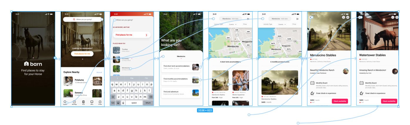
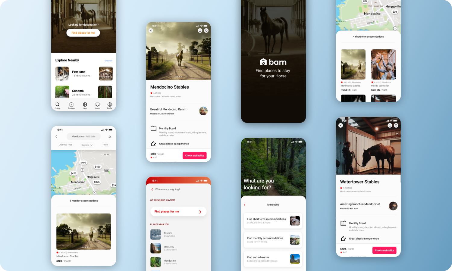
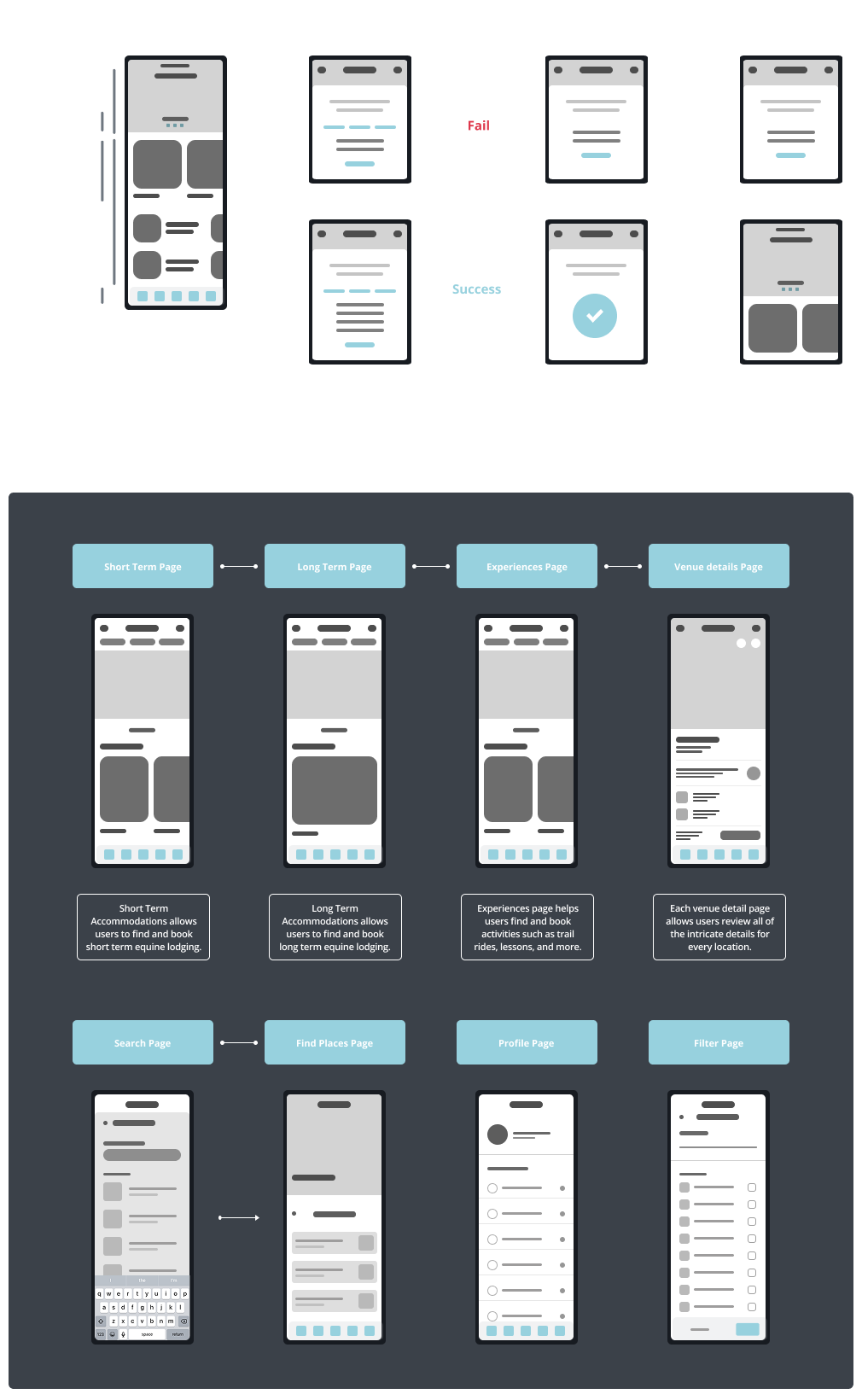
HIGH FIDELITY DESIGNS
Architecture of Barn.

BARN 01
FIND & BOOK ACCOMMODATIONS
Barn makes it easy for users to search, find and reserve equine accommodations and activities throughout the United States.
Users can also sign up as a host, and list their property details.
Connect with possible renters, and easily manage your bookings.


SHORT TERM BOARDING 02
SHORT TERM STAYS
There are multiple reasons and scenarios users could need short term accommodations (e.g., competitions, relocations, vacations).
Short-term users will likely want fast, trustworthy filtering and booking, with safety and convenience front and center.

LONG TERM BOARDING 03
LONG TERM ACCOMMODATIONS
There are multiple reasons and scenarios users could need short term accommodations (e.g., competitions, relocations, vacations).
Users can also sign up as a host, and list their property details.
Connect with possible renters, and easily manage your bookings.

PROPERTY DETAILS 04
LOCATION FEATURES
Each Barn property page has unique details and special features listed, as well as a photo gallery.
Allowing people to easily check availability and make a reservation or appointment was one of the features that was most sought after by users.
HIGH FIDELITY DESIGNS
Barn application.

KEY FINDINGS
Measuring success.
What went well…
The idea took on life with initiative, research, and interviewing multiple people in the equine community. Getting early feedback from user testing was invaluable, which helped shape design decisions. I designed the first phase of a seamless and trustworthy digital experience that allows horse owners to find and book safe, appropriate accommodations for their horses—whether for short-term stays or long-term boarding—while meeting the unique needs of both horse owners and stable providers.
This design captures the essence of balancing usability, trust, and the specific care considerations of horse ownership.
What I would do differently…
Focus and be attentive to design for intuitive navigation and a clear user flow, minimizing the effort required to achieve user goals.
Next Steps…
Continue to develop and refine the Barn app. Continue with more research and interviews — focusing on hosting. Taking that insight to build out hosting section.